A successful intranet site engages and connects every member of the organization, supports their daily activities, reflects the company culture and allows them to get the work done more effectively.
Isn’t it time to further organize your modern intranet – by building it with SharePoint and Microsoft 365 – to enhance employee engagement and change the look of your internal sites?
Intranet brings together people and information that reflects your organization. With the introduction of the new Megamenu in February 2019, it makes it easier to let users organize and navigate through the sites in a much engaging manner. As of now, the megamenu feature is available only for hub and communication sites and is released only for targeted release customers in Office 365.
The new header layouts make the sites more useful for groups with diverse requirements. Megamenu allows the users to organize and showcase navigation items of websites in an engaging manner. The new Megamenu options enable multiple levels of hierarchy at once; this will allow users to organize better and showcase the content and the sites.
Features of SharePoint Megamenu
- You can turn on/off the mega menu option in the change the look edit panel
- Comfortably adjust the header of your sites for easy viewing
- You can add a site footer to display information at the bottom of your sites like text, hyperlinks or just a logo
- You can update “change the look” edit panel, it consolidates all modern site look & feel options
- Site headers allow adjustment of layout options, logo and a background based on your choice
- Megamenu offers you to apply for additional designs, to view any applied site designs go to site settings > site designs, to apply
- Helps to organize your site navigation
How to Get Started with SharePoint Megamenu?
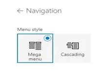
To use Megamenu, go to “Change the look” and Select “Megamenu” in navigation.

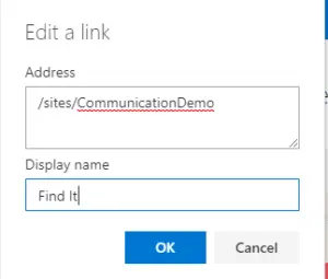
With the megamenu, you have two choices for your links: Header and URL (as shown below). The Header option allows you to create a link category that doesn’t go anywhere — it’s just a way to group sub-links.
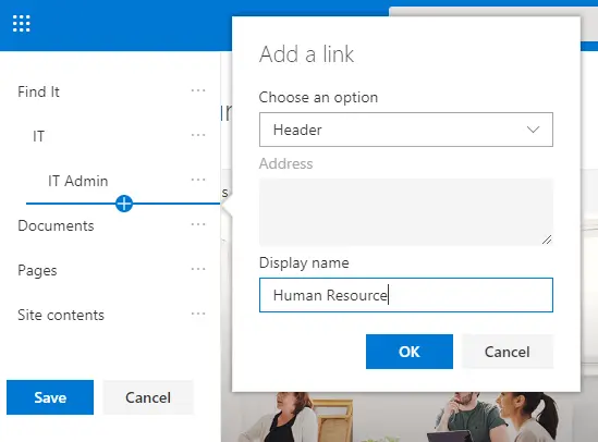
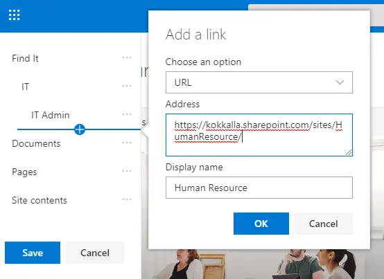
To create a good user experience, you can use three levelsof links. The first level is the tab (see Find It in the example). The second level is the category (see Information Technology, Human Resource, Facilities, Communication, etc. in the example). Both the first and second levels should be Headers, not URLs. The third level is the best place for your URL links (look for Administration, Training, etc. in the example).

WinWire inspires you to build and organize your sites, your intranet – the way you want them to be consumed by your users. As you make progress year over year, keep creating and sharing easy-to-navigate information and experiences to your users.
