In the data-centric world, visually appealing and interactive dashboards are crucial for effective insights. Dynamically displaying logos based on user choices in Tableau enhances user experience, adding a personal touch and making reports more intuitive.
This blog will cover three easy ways to dynamically show a company logo in Tableau based on user selection. Whether you’re a beginner or an expert in Tableau, these methods range in complexity to fit your needs. Options include using URL paths, sheet swapping, and shape marks to achieve this.
Scenario – How Dynamically Display Logo in Tableau Dashboards based on user selection?
We can try using the methods below. I have used a Segment column (2 Fields) in Sample superstore data.
Different Methods to Dynamically Display Logo in Tableau Dashboards
Method 1
This method does not always work as it depends on the tableau versions. If we miss something in the URL, it will not reflect properly. Secondly, we don’t use the logo in URL mode for business security.
- Upload the new data in Excel columns as Segment and Logo path. Under the Logo path, please use the URL.
- Go to the tableau sheet and select the Data type for the Logo path as Image > URL
- Bring Logo Path into the rows/columns using segment as a filter.
Method 2
We can partially achieve this by using swapping sheet options. We can do this on the sheet level, but getting to the dashboard in a single container will be tough because it contains images and is a lengthy process.
- Let’s take, for example, a segment column that contains two fields, Corporate and consumer, and you want to show logos for each segment.
- Firstly, select two different logos and save them into the Tableau repository.
- Select the segment column and create a parameter for the Data type as a string. The allowable value is List. Click okay.
- Create a calculated field and name it as a calculated field and name it as a select segment. Drag the parameter into the calculated column.
- Create a new sheet and name it Corporate. Type Min (1) in the row shelf and untick the show header. Make none for all borders and gridlines.
- From Marks card, select as shape > click on shape> Reload shape and apply it to the corporate logo > click on entire view>
- Select parameter > Right-click and click on show parameter and select parameter > drag select segment calculated field and bring it into the filter shelves. Automatically, it will show the corporate file and check the box.
- Duplicate the sheet and rename it Consumer>. Follow the same criteria as above, but use the consumer logo instead of the corporate one. In the parameter, select consumer and filter also consumer.
- Create a new dashboard > Take a vertical/horizontal container and get into the dashboard.
- Drag the corporate sheet into the container, the consumer sheet into the same container, and click on hide title. Make sure both sheets are on the entire view.
- Select any sheet and bring a parameter to the dashboard. Select one sheet and bring a parameter to the dashboard based on your parameter selections. The sheet will now appear on the dashboard.
Method 3
I have found the easiest way to achieve this, which is doable in a few minutes. It dynamically functions and applies to all the relevant data sources.
- First, select two different logos and save them into the Tableau repository.
- Create a new sheet>bring segment column into filter shelves > under marks card select as shape > bring segment column into Shape > Click on shape > by default, it will be assigned in automatic shapes> click on reload shape > select the segments and assign the shapes accordingly based on your saved logos. Make the entire view and size you can select based on the dashboard fit.
- Create the new dashboard > Get that sheet into the dashboard. , the Segment filters are available by default. Based on your segment selection, a logo will appear on the screen. Make sure to uncheck the apply-all button. We can bring this logo onto all the sheets and apply the segment filter to the relative data source so that the segment filter will not be needed in all the dashboards. The filter will work dynamically in all the dashboards, just on the first dashboard segment.
Note: To keep it confidential, I have used the segments column in the blog documentation instead of the Company field.
Bar Size Fix is in Tableau for single cells dynamically.
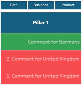
Requirements – Report which consists of all the Strategic Pillars separately and show their data to their respective Pillars. Will have to show just their categorical labels only and we cannot include other fields. Below is one of the demo Samples which is based on dummy data.

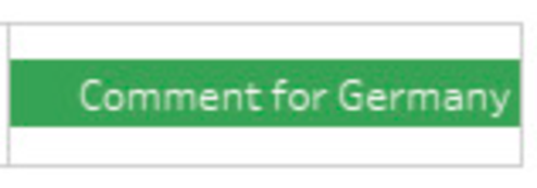
When we filter and see the different data around, then we might have a single cell also, which is coming as half cut. Below example for the reference.

Case Scenario – How do you fix a conditional background for a single cell?
Remarks– As the Client had mentioned, we must not add any extra columns to the visuals and should not change the chart type, etc. They just need to see it like that.
I have tried several sites to find out the solutions, but we were not getting the solutions. At last, we had informed that Due to Tableau restrictions we cannot do it into single cell.
After some trial and error, we have found a solution to this, which is not available.
Methods
First, create one transparent image like the one below and save it in the Tableau Repository.

In the Tableau workbook, follow the steps below to display logo in Tableau dashboards
- Under the mark cards section, please select Shape. Click on Shapes> More Shapes > Reload New Shapes> Select and assign that image with the symbol that is showing in the Shapes section.
- Remove any attribute if it’s available in Size.
- Under Size, make the one-time manual adjustment as per the Dashboard Entire view.
- Legends keep it the same. Based on the legend selection, the Bar color will change dynamically.


