Trends in the Mobile UX/UI Design constantly keep changing. Users quickly decide to switch to better, faster and simple devices to enhance their UI experiences and to make like easier. That is why designers are prioritizing the user experience while designing the mobile apps to create a uniquely intuitive and comfortable UI, which no one has ever witnessed before.
And, if the user ever gets lost or gets confused with website’s look and navigation, it simply indicates that the UI design has failed miserably to fulfill its main purpose. However, we continuously wonder why design trends of mobile app change and what are the factors, which cause this change. The reason behind this is that the digital transformation is having a major impact on the industries and there is a significant growth in the mobile devices market. Many mobile apps transform popular features into our regular necessities. Additionally, in the modern world, people give preference to using their phones to solve everyday tasks.
Below are a few common popular trends:
1. Hidden navigation Hidden navigation is not a recent discovery. However, it has been not so popular of late. And, finally, the designers have started introducing this feature to save the space for viewers. One of the available ways of camouflaging the navigation is by creating a navigation drawer. Basically, the menu becomes available only when it’s needed and stays invisible all other time.
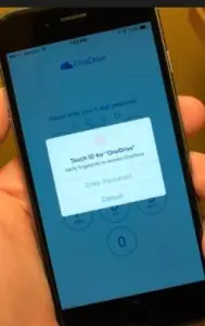
2. Touch ID is dominating In the beginning of the mobile era, Touch ID technology was used only for unlocking the devices. Now the Touch ID fingerprint sensor can verify your Dropbox, Apple pay and Amazon account etc. Moreover, it has also made the process of online verification much easier and safer.
3. Diffused background It is likely that diffused background will be making waves in the world of mobile apps design in the future. The clean simple style we associate with it works especially on mobile devices. Avoiding elaborate trends, diffused background has enabled designers to make the ‘call to action’ button easily viewable and accessible. We should remember that eventually, it’s the call to action buttons that generate conversions for your business and it is extremely important.
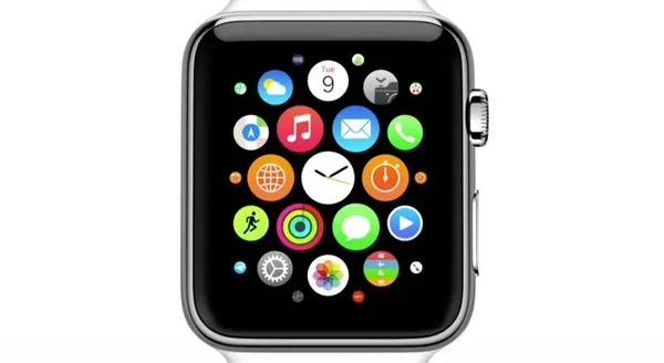
4. Wearing Technologies are trending Wearable technologies are in these days. Apple Watch has already won numerous hearts with various compatible apps available, challenging Android Wear to better their performance and compatibility with the Play Market. The day is not far when people will be wearing the devices rather than carrying them. Thus, in the coming years, we will see more designers and developers racing to create the intelligent, user-friendly wearable apps that are unique to this type of mobile device.
5. Personalization is becoming an essential element Flashy colors and lively interfaces create an incredible user experience. Fresh attractive designs pull more users to use and customize the apps to suit their requirement. These kinds of interface engross users with funny messages and notifications. Apps have become our best friends these days as they are providing us features without which we cannot world.
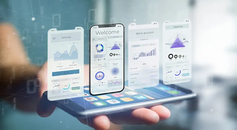
6. Card Design strikes back Another way to make UX more dynamic and meaningful is by using card layouts. Yes, one of the most popular mobile app design trends that started a few years ago, and continued to expand in, is Card Design. The card-based design has become one of the most talked about digital design trends in the recent months as UX becomes less visual and more functional, Card Design is undoubtedly a useful and effective tool for all mobile-friendly websites. The cards can help us to divide the content and properly place them on the website. Additionally, the cards can make it possible to download the multimedia objects and attract more traffic to the website.
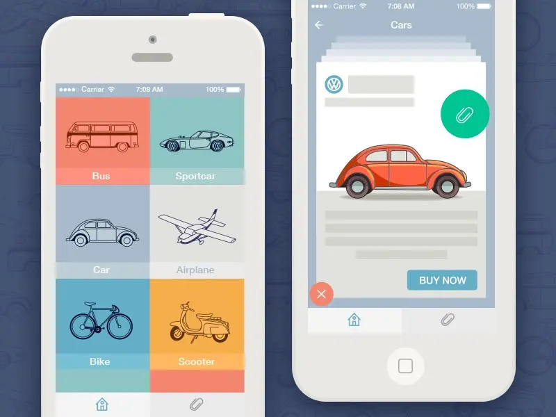
7. Material design is in- Bold, graphic, intentional
The roots of material design are in the concept of flat design, which has been a constant trend for the past few years and has become standard in UI/UX design. Google designed and created the Material design in 2014. However, nowadays a lot of apps and websites use this technology because it provides simple and fast-loading effects (gradients, layering, and animation). The material design along with card design, are two important trends that are going to last for long. It provides unified user experience and will be popular in future as well.
8. Calm color pallets Today “less is more”. Check out the popular apps we all use: Tumblr, Pinterest, Facebook etc. They all adhere to one color scheme with a few shades. It seems like flash and bold colors are no longer as attractive as pastel and calm ones. However, it does not mean you need to consider changing colors of your brand. You can, in fact, use the same color, but subtly and elegantly without going overboard.
What Future looks like?
To sum up, these trends will dominate the mobile landscape over the coming months. It’s no surprise that the designers are looking for more interesting designs to improve the UX and striving to create designs which users can connect with. You’re designing for your users. You must think about your user persona, consider the goals they have when using your app, and help them meet those goals. The easier your product is for them to use, the more likely they’ll be to use it.
